Theme
Mantine Theme
This project is fully compatible with Mantine themes.
You can use <MantineProvider> to apply the themes you want.
Check the Mantine documentation to learn more.
Custom Provider
To fully use this project at its best you can use the <Provider> component to generates 3 Mantine themes:
- A main theme with a primary color (color is cyan by default)
- A primary theme using the same primary color but as background color (text is white)
- A secondary theme using another color (gray by default) as background color (text is also white)
The ideas is to wrap some part of the application with the <MantineProvider> to apply a different theme depending on the result you want.
In this example:
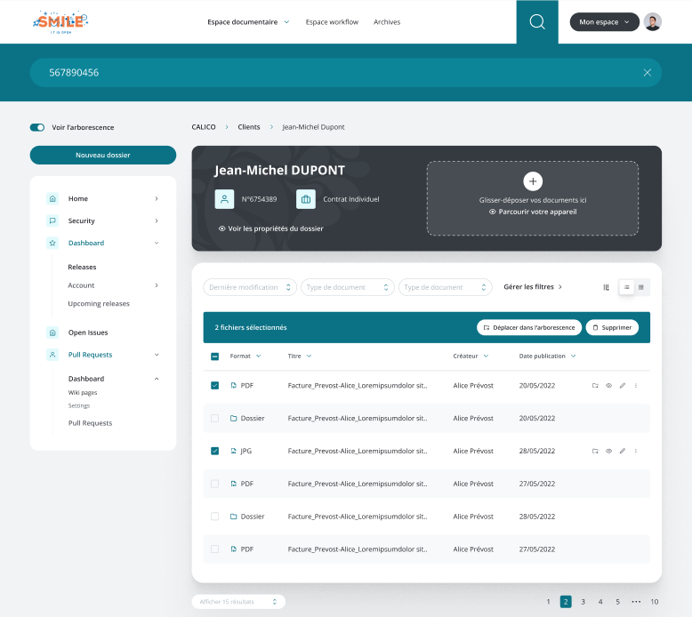
Here the main theme is applied globally, the primary theme is used on the search bar and the secondary theme is used on the top dark block that is above the table.
The code might look like this:
<MantineProvider theme={main}>
  <AppShell header={<Header searchTheme={primary}>...</Header>}>
    <FoldableColumnLayout>
      <MantineProvider theme={secondary}>
        <InfoBox>
          <Dropzone />
        </InfoBox>
      </MantineProvider>
      <TableGridView />
    </FoldableColumnLayout>
  </AppShell>
</MantineProvider>
The <Header> component use a <MantineProvider> internally to apply the theme passed as the searchTheme props.
It may be quite difficult to create these 3 themes that look harmonious so we provide a provider to assist you.
You can import our provider from @smile/haring-react-shared and use it at the top level of your app:
import { Provider } from '@smile/haring-react-shared';

export default function App({ children }) {
  return (
    <Provider primaryColor="blue" secondaryColor="teal">
      {children}
    </Provider>
  );
}
The <Provider> also automatically apply the main theme.
And you may get the theme configurations to pass to the <MantineProvider> with one of our hooks.
Provider Props
| Name | Type | Default | Description |
|---|---|---|---|
| baseTheme | MantineThemeOverride | - | Theme override that be applied to all 3 themes |
| children | ReactElement | - | Content |
| colorScheme | 'dark' | 'light' | 'light' | Main theme colorScheme |
| mainTheme | MantineThemeOverride | - | Theme override that be applied to the main theme |
| primaryColor | keyof MantineThemeColors | 'cyan' | Primary color |
| primaryTheme | MantineThemeOverride | - | Theme override that be applied to the primary theme |
| secondaryColor | keyof MantineThemeColors | 'gray' | Secondary color |
| secondaryTheme | MantineThemeOverride | - | Theme override that be applied to the secondary theme |
Hooks
useThemes
Returns all 3 themes.
Usage:
const { main, primary, secondary } = useThemes();
useMainTheme
Returns the main theme.
Usage:
const main = useMainTheme();
usePrimaryTheme
Returns the primary theme.
Usage:
const primary = usePrimaryTheme();
useSecondaryTheme
Returns the secondary theme.
Usage:
const secondary = useSecondaryTheme();